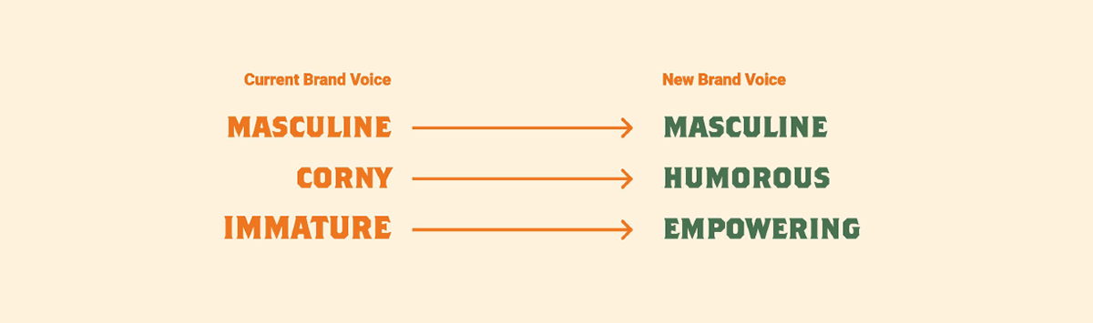
Dr. Squatch is a soap company that specializes in creating handmade soap bars made purely from organic and natural ingredients for men. The current brand tends to be exclusive rather than inclusive, relies too heavily on memes instead of targeted messages, and requires a more elevated visual brand to appeal to a broader audience.
By updating the brand visuals, language, and advertising messages, Dr. Squatch can not only keep their current audience, but include others interested in all-natural products made specifically for men.
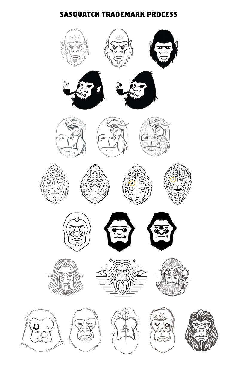
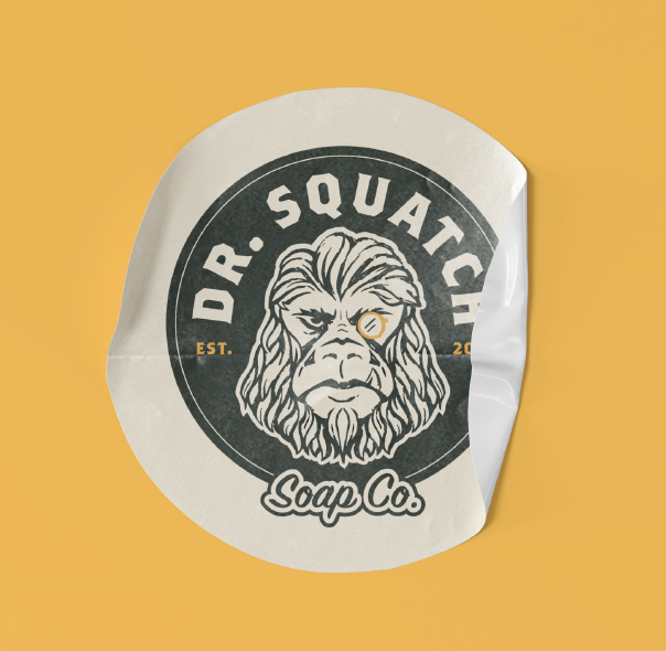
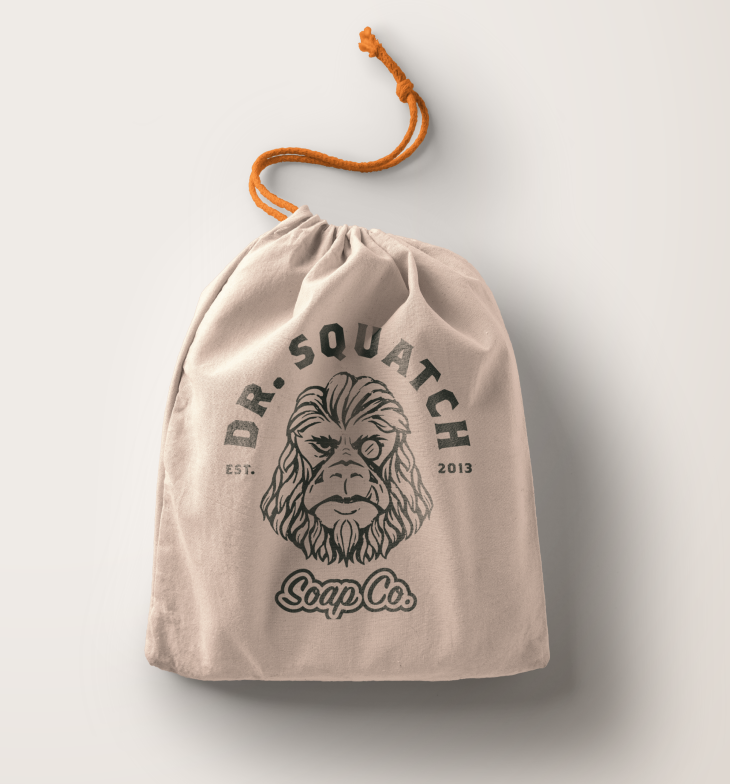
When making a logo out of an unfamiliar form I like to first start with a realistic version (first row) as a means to get more familiar with the shapes I'm working with. Once I get more comfortable with it, I'll caricaturize and exaggerate it and experiment with different layouts. Occasionally I'll create a very abstracted version and see if I can draw any inspiration from it, which is the method I used to create our final sasquatch icon. (final row)
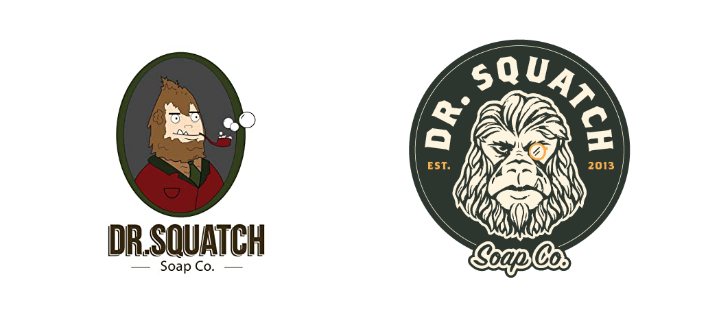
old logo new logo
delivery package
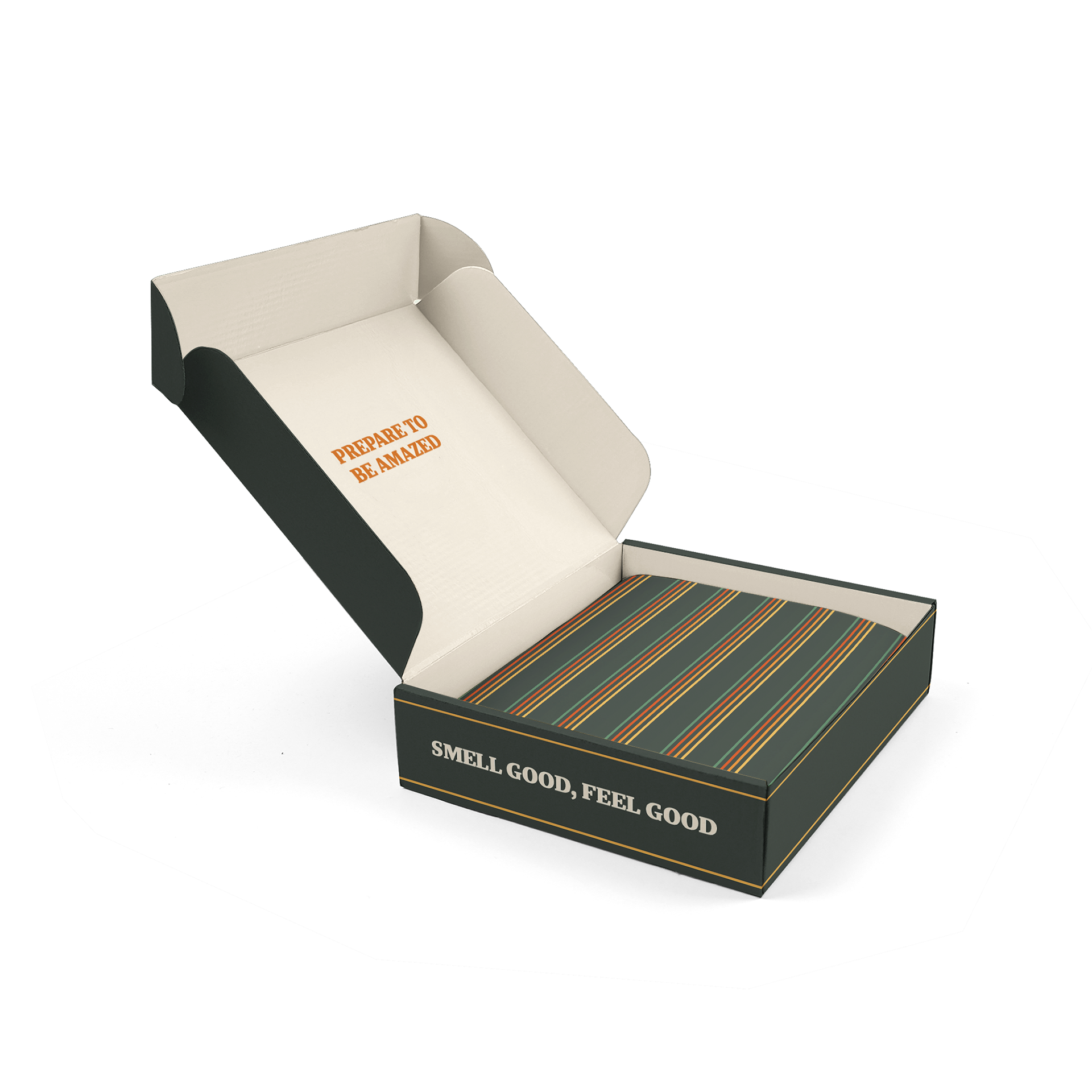
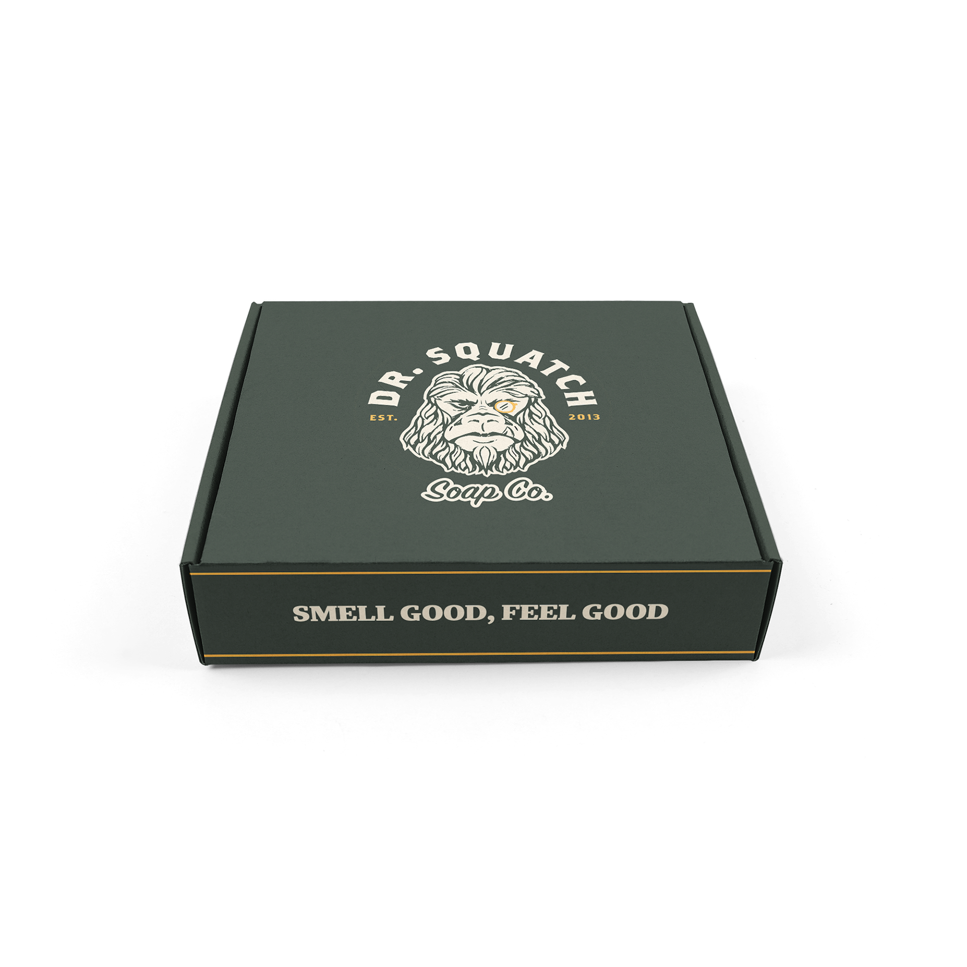
SOAP BOX PACKAGING

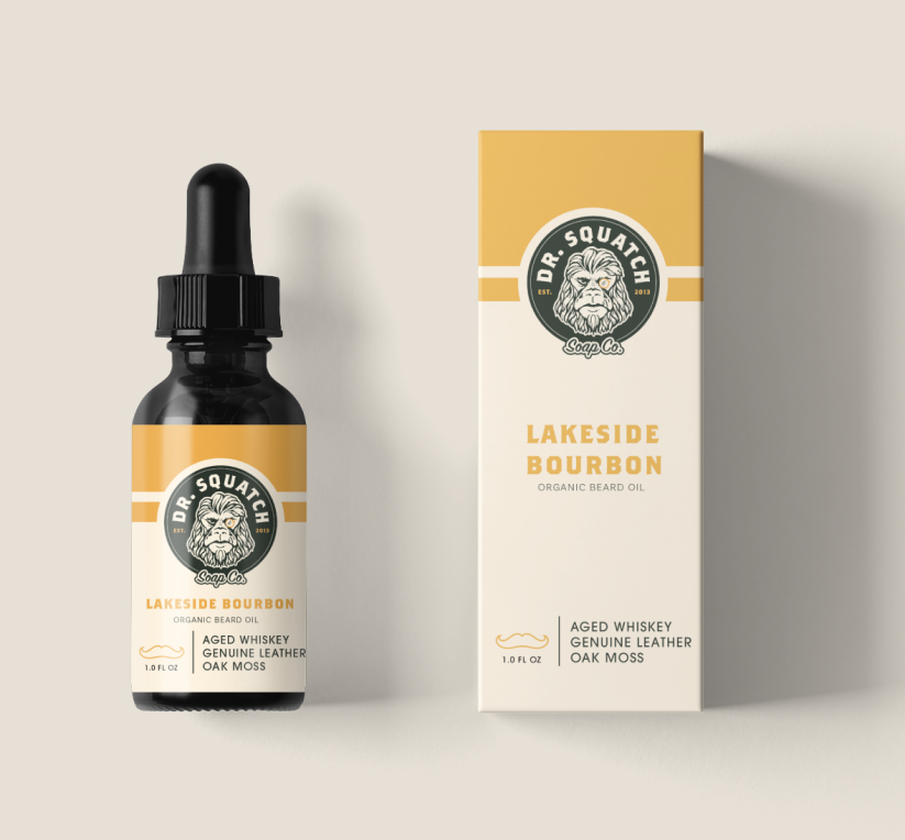
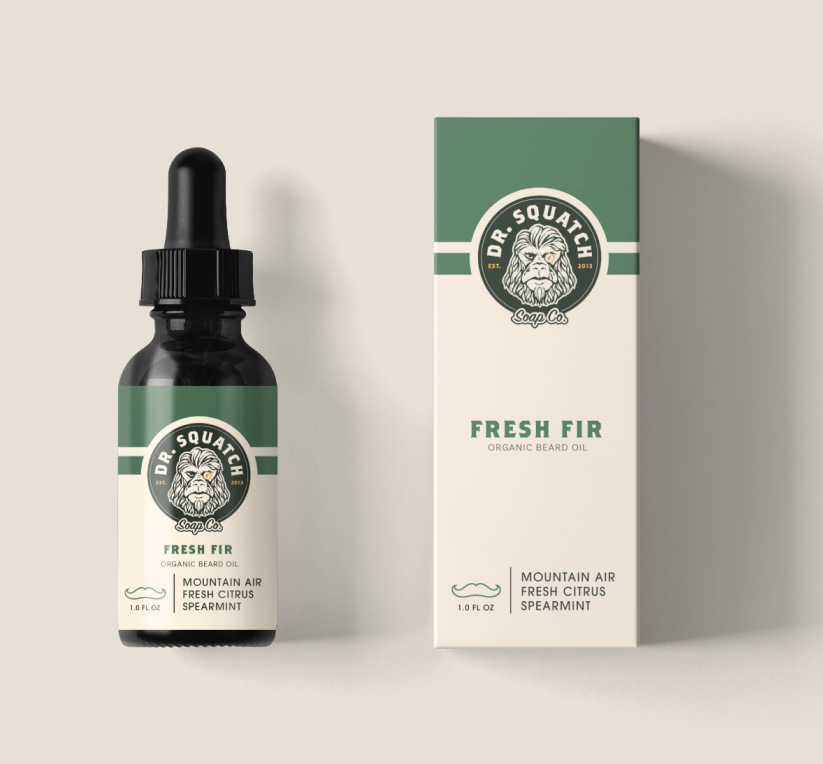
BEARD OIL PACKAGING
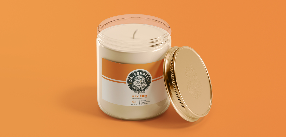
CANDLE PACKAGE
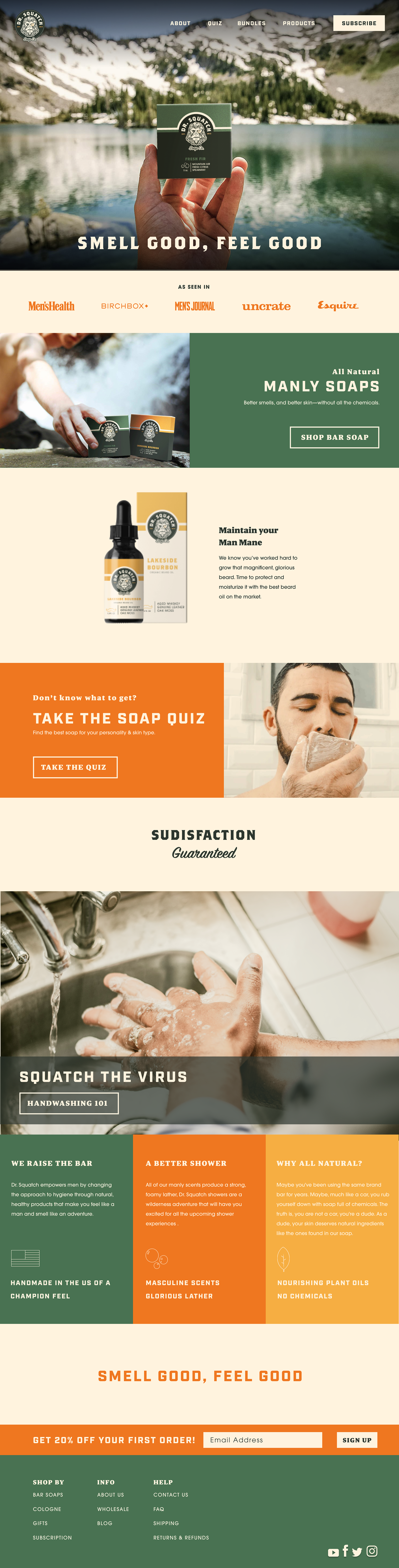
HOMEPAGE
INSTAGRAM ADS
INSTAGRAM FEED

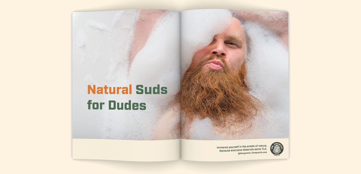
EDITORIAL ADVERTISEMENT
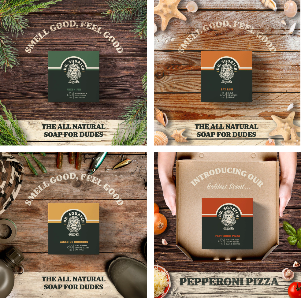
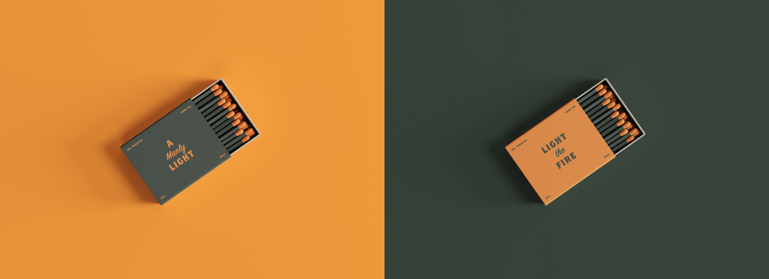
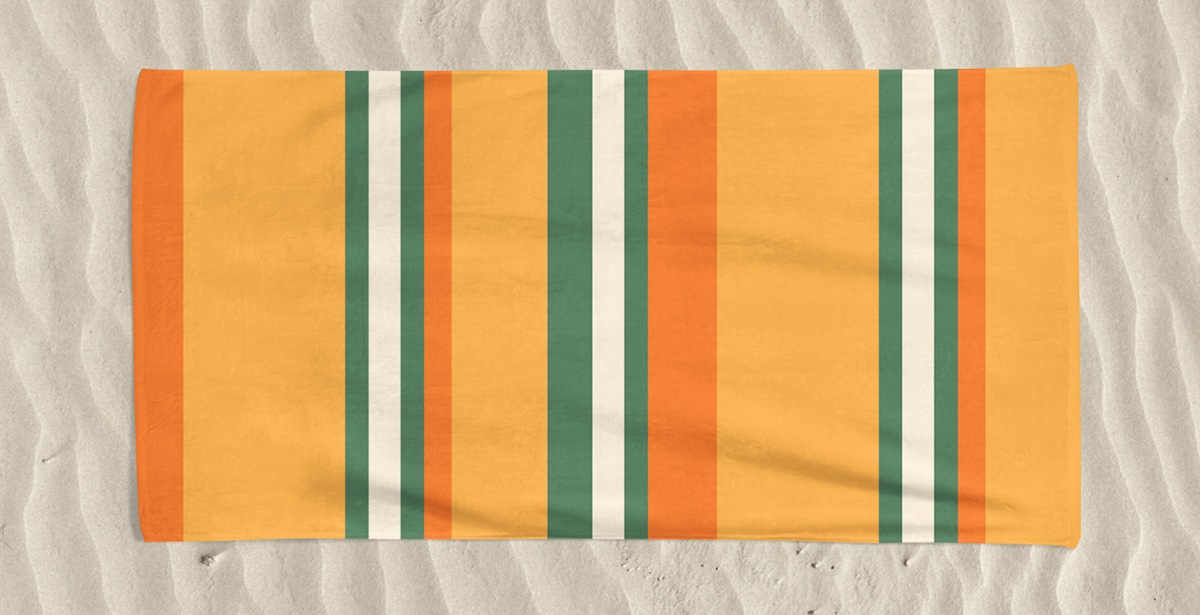
EPHEMERA
Credits:
All: Research, Art Direction, Identity Exploration, Packaging
Lizy Ainsworth: Trademark Illustration, Delivery Box Package, Soap Box Packages, Social Media, Instagram Ads and Editorial Ad
Paloma Sanchez Santana: Website, Taglines, Copywriting, Editorial Ad copy
Megan Hicks: Emblem Design, Pitch Deck Layout, Website, Copywriting, Ephemera
Lynz Candace: Website, Icons, Ephemera